Thursday, November 4, 2010

A Circular Ending

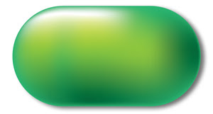
A green capsule shape, with perfectly circular ends.
Sometimes you find yourself needing a quick way to accomplish tasks and assume that those methods somehow work the same across applications. I recently ran into a big issue over a small detail that tripped up the quality of my work, and that of others. I needed to turn a rectangle into a capsule or end cap, for lack of a better description. Not an oval, or just a roundly-cornered rectangle, but a shape that ends in a perfect half-circle. Where I currently work, this shape is an essential part of our brand identity.

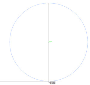
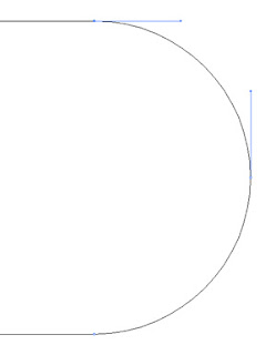
There is a certain method you can use in QuarkXPress, Adobe InDesign and Adobe Illustrator, combining a circle precisely placed halfway over the end of a rectangle using a Unite or Merge path function, also called Pathfinder in Adobe Land. Placing a circle over the end of a rectangle. A Pathfinder Unite function will be applied to it.(Some future time, I should explain and demonstrate Pathfinder more thoroughly. It’s the best graphic invention since sliced bread.) If you had the circle placed exactly halfway, you should get a perfectly circular end for the shape, with no doubled anchor points where the rectangle’s end and the half point of the circle overlapped. A look at the anchor points of one example created in Adobe Illustrator shows a proper result with just three anchor points.A successful uniting of a circle and rectangle using Adobe Illustrator
However, I am one to try doing this stunt in less time and with less clicks. That’s my motto! I can create this using just one rectangle.

Here’s how it works in QuarkXPress: Copy the short width of the rectangle, paste it into the corner radius field on the Measurements palette and divide it in half. For example, if a rectangle had a short side of just 6 picas you would enter “6p0/2” into the corner radius field. (This allows you to use a rectangle of any measure; you don’t have to do the math.) Unfortunately, in QuarkXPress, you need to use a short size no more than 4 inches; QuarkXPress’ corner radius is STILL limited to 2 inches.Setting the corner radius of a rectangle in QuarXPress
Anyway, I digress. What is your result? A perfectly circular end cap.

“Now,” I”ll say to myself, “I should be able to do the same thing in other applications. No problem.”
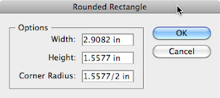
So, I’ll go into Adobe Illustrator. Here’s a slight difference, because Illustrator’s corner radius is not dynamically adjustable. You have to know ahead of time what the radius should be, and that totally depends on you knowing what the short measure of the rectangle will be when you draw it out. Have fun there. But if you have a dimension in mind, you can Option-click with the rounded rectangle tool, and right there enter the half of the short side’s measure for the corner radius (as shown).Creating a circle capped rectangle using the rounded corner rectangle tool.

Luckily, Adobe Illustrator also has a cool feature in the Effects menu for a square cornered rectangle you already have drawn out. (And it also works on open shapes too, so it’s handy for die lines and such things.) Select the rectangle, copy the short side’s measure from the Options bar, and go to Effects > Illustrator Effects > Stylize > Round Corners. Paste the measure into the radius field, then type “/2” after it. If needed you can expand the appearance of your end cap, but of course it’s not necessary.

What’s next? Adobe InDesign. And here’s where the trouble comes. I expected all these years that Adobe InDesign would act the same way as QuarkXPress and Illustrator. But I recently discovered that NOT to be true.

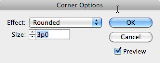
In previous versions of InDesign, you can use the Corner Options dialog to set it, similar to Adobe Illustrator.InDesign CS4's Corner Options dialog Curious and disappointing is the result you get if you want the perfectly circular end and input half of the short side. Compared to a true circle, you will notice the bulge. It doesn’t even pretend to be circular.InDesign's out of round corner radius set against a true circle.
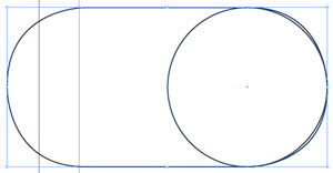
InDesign CS5 now has the ability to dynamically change the corner radius of any rectangle—finally, after 7 versions! However, even that doesn’t help us here. The results are still geometrically out of round.

So in InDesign, we come full circle to using Pathfinder to accomplish this task. Of course, even this beats manually splicing the two shapes together, which, more than 10 years ago, was the only choice for doing this.

Wednesday, August 4, 2010

Keep It All Together

How to prevent your type elements from breaking apart.


There are times you want to allow words to break down to the next line in a block of type. The judicious use of a discretionary hyphen – one that breaks apart a word if that word is close to the margin – is important for the proper flow of justified columns of text, for instance. The whole concept of hyphenation and justification is out of the scope of this discussion, however.

Much more often, where the text is somewhat more concise than a magazine or blog article, and its appearance is more critical, you really don’t want to see any hyphens, but then you may run into some other issues with your type. For example, you may see phone numbers break at the margin and finish on the next line, and you don’t want that by any means. You also may have a company or brand name that is not supposed to ever break into two lines. Harley-Davidson comes to mind here. Then there’s the pesky instance when your email or website address breaks at the “www.” or the “com” end.

For work on the web, there may not be much help besides a forced line break. But in printing, with a good layout application at your side, such as Adobe InDesign, or QuarkXPress, you have all the tools you need to accomplish this task.
Say, for example, you set up a contact message for your client; the usual, with the phone number, office hours, email and web address. If you don’t want hyphens, you should turn off hyphenation before you proceed. Now it is time to tackle some of those items you don’t want breaking apart.
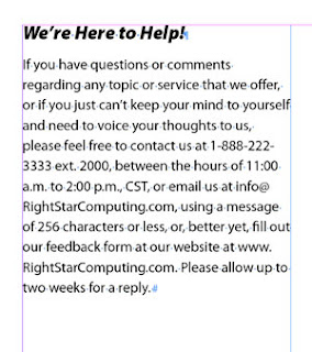
a sample text block showing broken phone number and web address
Seeking a single line dial-up

Phone numbers are never easy to memorize, but that’s even more difficult when they break down to the next type line. A typical solution for many is to use a forced line break just before the phone number starts. This keeps the phone number on one line, but visually it may be on the wrong line, and you may end up with a large visual gap in the line above.
a forced line break

Let me just suggest right here that you make forced line breaks the LAST RESORT for fixing type events like this. Refrain from using them until the final tweaks of text tweaking. The whole issue is text flow. If a forced line break is in your type, and you for some reason change the type size or margin width, or edit wording in a paragraph or sentence, then the text flow shifts, and now the forced line break causes a new problem, and you need to delete or reposition it.

With the following solutions, you need not resort to the potentially problematic forced line break patch-up.

Nonbreakable

The answer for a phone number (at least, if it uses hyphens) is to use a nonbreaking hyphen. Nonbreaking hyphens are discrete, because they look and taste just like normal hyphens. But they have the power to hold words and characters on either side of themselves together.

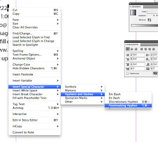
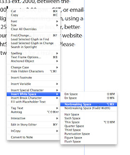
Simply select the hyphens in the phone number in question and replace them with nonbreaking hyphens. Both QuarkXPress and InDesign have access to the nonbreaking hyphen character. InDesign can access it via a context-sensitive menu. QuarkXPress also allows nonbreaking en and em dashes, which InDesign doesn’t.
InDesign's context menu to choose the nonbreaking hyphen
(What I am frustrated by with InDesign on a Mac is that even though you should be able to access a nonbreaking hyphen with a keyboard shortcut, the default command never works. I have used InDesign from CS2 through CS4 on several Mac systems over more than five years, and I have never gotten it to work, unless I set up a custom command.)

Another important helper is the nonbreaking word space.
InDesign's
Possible circumstances you will want to use this for is such things as dates (August 7, 2010) and times (7:00 p.m.) So just like the previous hyphen issue, select the word space between the words you want to keep together and replace it with a nonbreaking space. (I am happy to say that InDesign’s keyboard shortcut for this one works!)
a nonbreaking space in action

Fixing the dot-com break

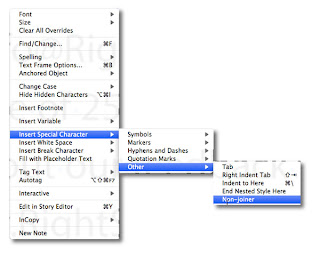
Because a website address begins with a “www.” and ends with “.com,” or such, there is a tendency for it to break at these points. This is where I used to place a forced line break before the beginning of the web address to fix the problem. I don’t do that any more. Why? Because I found a little special character called a Non-joiner tucked away in the Other sub-menu of the Insert Special Character menu of InDesign.InDesign's Non-joiner menu
Technically, it is not a space. This makes it handy to place it between any two characters to prevent a break. (For QuarkXPress, you can place a nonbreakable flexible space and horizontally scale it down to nearly 0 width.)

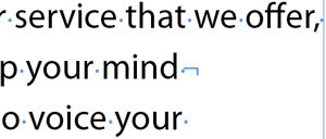
So I place my insertion point on the right side of each “dot” in a web address and insert this non-joiner. Voila! This web address will not break any more. It will flow in the text naturally to whichever line it fits on best.
an example of a web address with non-joiners to hold it together

So wisely using these special characters will allow you to have more control over the look of your type, minimizing restrictive forced line breaks and similar inferior solutions.

Wednesday, July 21, 2010

Efficiency

One aspect of doing production art is the aim at being efficient. Of course, accuracy is key, but after that has been established, you need to examine a project or your everyday workflow for ways to streamline the processes involved.

It’s just like any kind of manufacturing workflow; if you want to increase the profitability of any process, you need to look at how to make the end product with the same or better quality in fewer steps, if possible, or make the steps you take more efficient.

Currently, I am working on a project with a client, where the process of the production for some document type has had an established process for about two years. One production artist employed previously had some scant documentation which I was to follow. The current production artist on staff needed some help with the overflow work, and some of the jobs had unique twists that were also giving some unexpected results when following the currently understood procedures.

So, I took up this project with an aim at first learning the given procedures, then examining the whole aspect of the workflow to see what can be modified, or fixed.

After being on this assignment for almost two months, what have I discovered? Basically, almost half of the steps that used to be taken to work on each job were never really necessary.

If the previous production artist had had the time and asked the question “Is there anything I can do to make this process better?” he may have tried a few things, or looked at how the software REALLY works, just to see what could be changed.

There is no harm in copying a layout file, for example, and trying something to see what happens. What’s the worst that could happen? Either the document is so screwed up, you need to revert, or the application might freeze or crash. Big deal.

If not, maybe you see something that needs to be done differently, or you stumble upon a way to do your work in a few less steps. And in a busy workflow, that could save many minutes over the course of a whole day.

What did I do?
  • Pre-emptively set up an efficient set of type styles that fit into all elements

  • Identified adjustments to the procedures that by-passed the previous need for several work-arounds

  • Fixed some problems caused by a script by writing a new script that did not create the same problems (the original was JavaScript, I used AppleScript)

Now, we can do the production for these documents in half the time they have been done. That might allow the company to which I am now assigned to keep their staff for production artist at one. That might mean I may not get offered a permanent position by them. But that at least means I should get a good report from them to the temp agency for which I am working. Hopefully, that will land me another assignment quickly after this one’s done.

So what are some things you can do or have done to increase your efficiency?

Monday, January 4, 2010

Production Art? What’s That?

I am starting this blog to discuss current and past issues in the realm of graphic Production Art, speak up on ideas and trends, or comment on ideas already out in the Graphic Arts industry that affect Production Art, and share work methods and tips & tricks.

Right now, I just want to say some points on what graphic Production Art is. It’s kind of a limbo discipline. It is stuck halfway between Graphic Design and Final Output/View. Since the beginnings of the Graphic Arts, it used to be limited to only printing, but that has all been changed with computer-based publishing, the Internet and the proliferation of interactivity to many publishing outlets.

Though the media may differ, the objective is the same: Make the end product look as it is intended, and make sure it functions properly to get it to the viewer the best way possible.

Now, that is fairly broad, but that is because the road a Production Artist takes to a well-crafted and functional file, or brochure, or what have you, will wind through a multitude of graphic processes and evaluations, then fixing as needed.

For any of you who are “new” to Production Art, at least in experience, let me give a rough overview of who needs to or does it, and what is usually involved in doing it.

Who Does Production Art?
There are basically three groups of people in Graphic Arts who utilize Production Art:
1) Art Directors / Graphic Designers
Those who have to do Production Art are usually in the need to do it, mainly because they are in a small agency or department, or working freelance, and may have to fulfill all the duties in getting a design out to the client or vendor.
2) Production Artists
These are dedicated to mostly processing the files as they come from Art Directors and Graphic Designers, and are usually a strategic part of the workflow in a larger agency or graphics shop. Production Artists need to have as much creative as technical know-how, because they may need to often re-apply approved designs to other media pieces or throughout a campaign, varying the formats and aspect ratio of elements.
3) Pre-press and “Output” Operators
These are the ones who get the "final" versions of graphics files from 1 & 2, and maybe other sources, and need to process them to the actual final state for the intended use. Now the job isn't just printing; it could be web pages, mall kiosks, digital billboards or such like. When these files come in, they may need changes, or on further evaluation, some elements may need to be fixed. These persons are more tech-oriented than creative in most cases, because of the high degree of technology involved in the final delivery of the work they need to support.

What Does Production Art Involve?
Like I said before, there are many processes and areas that must be undertaken in the work of Production Art. Some of these are obvious, and others are so behind the scenes that few are aware they are done at all. These will usually include (but are not limited to):
  • Page layout -- which itself is a multi-faceted discipline
  • Image retouching and compositing
  • Color correction
  • Color concepts, such as color harmony and color modes (RGB, CMYK)
  • Illustration file servicing, trouble-shooting and fixing
  • Creative processes and communication
  • Final file, publishing and output specifications
  • Spelling and grammar checking
  • Proofing printing
  • Mock-ups -- setting up printed proofs to look and function as a final product
  • Preflighting -- checking and fixing files to meet expected output criteria
  • Measuring, measuring, measuring!
  • Word processing
  • Typography -- particularly, kerning, tracking, and stylizing and “massaging” text
  • Printing processes
  • HTML, CSS and basic web page structure
  • Multimedia formats
  • Image resolution
  • PDF workflow -- making, distributing, commenting
  • Computer file formats
  • Methods of delivery for project files
A Production Artist may not be an expert on all of these things, but will at least have enough understanding of most to be able to produce solid and reliable final files day in and day out. That means more than “enough to be dangerous.”

A Common Ground
The most important element tying all these disciplines and processes together is the arena of the page, or the issue of “pagination,” or page assembly. Now, if you looked up the word pagination, you may not find the job description of Production Art around. But the whole work of Production Art centers around getting everything properly onto pages, or layouts, whether static or dynamically made.

Think of it. A newspaper layout is a page, or pages. A web layout is a page. A screen of a billboard or kiosk is a page. I remember almost ten years ago, there was a lot of banter in creative and graphic art circles about the term pagination being used for this particular thing.

All visual and text elements that communicate must be paginated into a format that a reader can make some coherent sense from. It is imperative that it not only looks good at the design side of the life of that “page,” but that is also holds together on the reader’s end. The same might be said in way of illustration of a car. The design of that car can look great, but if it doesn’t run because the engine wasn’t assembled right, or parts fall off as it’s driven down the highway, then it obviously was not a successful production. There can be just as much work “under the hood” as visually in a graphic art production, to keep it functioning as well as looking great.

Good Qualities Desired
A Production Artist needs to have a handful of characteristics and skills to keep at the job:
  • Contentment doing that part of the job, rather than great design, at the time
  • A constant need for attention to detail, even the smallest measure at times
  • Tenacity to see work through to the end
  • Pleasure at seeing files are built well
  • Trouble-shooting instincts, to find problems and solve them quickly
  • Thoroughness to follow procedures
  • Speed -- of course, your boss or client needs it done fast
  • Accuracy
It is also helpful for he or she to be able to find and implement any improvements in a working process that may need it. For example, if a need is seen in setting up a useful filing structure for current and future work, can that Production Artist come up with ideas for one that meets the most needs?

Hopefully, here we can look at some of those issues and discover more about this often-overlooked job, and create some great dialog in the coming months and years.

Have any ideas or comments? Did I get anything wrong, or does anything need clarification? I welcome your input!