Friday, April 24, 2015

Adobe Acrobat: Buttons – Part 2

Finally, I continue to expound on what buttons can do in Adobe Acrobat Pro. Most of the functions I will cover are available in many versions of Adobe Acrobat prior to Pro. If you need a refresher on basic button functions, you should look up my first write up on buttons.

Of course, if you desire to follow along, then you will want to download the files I have prepared for this article.

So, this time we are going to begin making a set of buttons that will help us navigate a document without the use of windowed navigation features, such as the next and previous page buttons on the menu bar. This style of navigation buttons can be handy in some circumstances, such as a presentation-like document opened in full-screen mode, or without the window menus and such. (The current features of a navigation bar opening in a full-screen mode does already what we are going to do, but our exercise will help us gain insight in how buttons work anyway.)

So, begin by opening our main document, a small catalog of some dinosaurs.

our Dinosaur Catalog's initial page in an Acrobat Pro window

You will notice that I have also opened the Interactive Tool panel. This is our main access to the Button tool outside of the Forms panel.

Adobe Acrobat Pro's Interactive Objects' tools panel


Our first page is simply the title page, and will only be looked at initially. There is no need for a button here, but it will be nice to add an on-screen way to get to the next page, where we will build the set of buttons to use. To do this we will make a simple link.

So, first thing is to find the Link tool. It is in the Content Editing panel. Click on it and draw out a marquee surrounding the debossed area the title sits in. When it asks for what you want to do, leave it at “Go to a page view” and click OK. Navigate to the second page, where you can now click on the Set Link button in the floating dialog to set the link.

a screen shot of our Dinosaur catalog's initial page after drawing out the link marquee

the dialog box telling an Acrobat user to navigate to a page an set the Link


You may now go to the second page and select the Button tool. Along the bottom of the page, click and drag out a small area about 1-1/2 inches wide and under an inch high. You will notice the New Button dialog shows up. Click on its link to open the Properties dialog.

a drawn button marquee and its resulting Field Name flag
When it comes up, set the name of this button to “Previous_Page” and fill in the Tooltip to something  that tells the user to go to the previous page. Notice that the Common Properties on the bottom of this panel are for this form field to be Visible. That’s what we want at this time. If we had it Hidden, then the user would not be able to interact with it. One reason for using the Hidden setting will be given at a future installment yet.

Adobe Acrobat Pro button properties dialog General tab options

So next we progress to the Appearance tab. Here we simply want to set the background and border to None. We can ignore the Text settings, since we will not place any text in this button.

Adobe Acrobat Pro button properties dialog appearance tab options

We will ignore the Position tab, which is only found from Adobe Acrobat Pro XI and beyond, and move to the Options tab. Here’s where we begin to have some fun! We are going to use an icon for the appearance of the button. An icon is simply a graphic we create in some other application, such as Adobe Illustrator, to make the button look differently from what you can get from within Adobe Acrobat’s options (which aren’t much).

As long as you can export your graphic out to either a PDF, PNG or similar file format, then you should be able to use it in your PDF document. I wouldn’t recommend a JPEG file, because if you have a rounded corner or any non-rectangular shape, you will get a solid white background in your non-image areas. Luckily for this exercise, I have some buttons pre-made for us.

Adobe Acrobat Pro’s button properties'  dialog in the Options tab

So, drop down the Layout menu and choose Icon only from the list of options. Choose Invert for the Behavior for now. You will notice that so far there is only an “up” state for this button. Next, click on the Choose Icon button. Navigate to where you have the Buttons folder of these project files, and select the file called “left_arrow_wshadow_ylw-up.pdf” and click through the OKs. When you get back to the Button Properties dialog, you should see a yellow arrow graphic pointing left within your button marquee.

our first view of the previous page button

Next, click on the Advanced... button to get into the Icon Placement dialog. This feature controls the way your icon will look within the button field area. You have options for when to scale your icon, and for aligning your icon relative to the sides or center of the button field. For this button, choose Never for the scale, and we will keep the position centered within the button field.

the icon Placement dialog found after choosing the Advanced button


Now we have to add the all-important action. Click on the Actions tab, select Mouse Up as the trigger and Execute a menu item as the action. Click on Add... to find a listing of menu items. Here you see items that are in common with Adobe Acrobat Pro and Adobe Reader. It is up to 3rd party PDF software developers to allow these commands to be in common with their packages. Select “View > Page Navigation >  Previous Page” as your action.

a list of available menu commands in Adobe Acrobat


By the way, the field box properties dialog is pretty versatile in one way: it can remain open as long as you have the Button tool selected. You don’t have to close it when going from one button or form field to the next, just click on the next field you wish to modify and it will reflect the options of that selected field.

However, at this time we want to close the field properties dialog, because we want to test this button to see if and how it works! So click on Close and then choose the Hand tool in Acrobat’s toolbar. Click on your new button and your document should go to the previous page, the first page in this case. Congratulations! Now we can go back to the next page.

Now that you have one button, it isn’t hard to make another one! Choose the Select Object tool in the Interactive Objects pane and click on the Previous Page button field. Hold down the Option/Alt and Shift keys and drag it to the right. This should make a copy of this button field. Double-click on it to open the properties dialog.

a duplicate of the previous page button


Now, we can change the particulars of this button so it becomes the Next Page button. The reason for working from a copy of the other button is that many other aspects of it, such as the size of the box, the background, how we scale/size the icon graphic and so forth, are already established. We should only need to change a few things.

Go to the General tab and change the field name and tip to say Next page.

Go to the Options tab and click on Choose Icon... and navigate to the button graphic “right_arrow_wshadw_ylw-up.pdf” to select it as the icon for this button.

Then go to the Actions tab and select the Execute a menu item action. You will see an Edit button become available, which, of course, you should click on to bring up the list of menu commands to use.  Select “View > Page Navigation >  Next Page” as your action.

select the action to edit it while in the Properties dialog
Select the specific action to edit it.

Finally, we will copy one of these buttons to make a Home button, so you can go back to this intro page. Like before, select one of these buttons with the Option/Alt and Shift keys held down as you drag it over to the center of the group of buttons.

Double-click on it to bring up the Properties dialog and change the Name and Tip fields to Home.

Go to the Options tab and load in the next icon file, “home_button_ylw-up.pdf.” Resize the box to show the entire icon. Don’t worry about the position of the box just now.

In the Actions tab, delete the current action and drop down the Select Action menu to choose the Go to a page view option. When you click on the Add... button, the Set Link box will come up. Simply click Set Link to make the current page the destination.

Boy! We've done a lot here, but before we finish for this lesson (and leave you hanging for a while), we will do a little housekeeping on these buttons.

Use the Select Object tool to draw a marquee surrounding all three buttons. Then right-click on one of them to bring up a context-sensitve menu. As far as I know, this is the only access available for some of the functions you find on this menu. Find the Align, Distribute or Center menu and wait for the fly-out menu of options to show. Scroll over to the Distribute Horizontally to even the buttons out. Then choose that Align, Distribute or Center menu once more and find Align Horizontally to line them up on their vertical centers.

access to the Align, Distribute and Center menu options

There you have it, a set of navigation buttons to use in this wonderful PDF document. And now you can pride yourself in learning something more that Adobe Acrobat Pro can do with buttons.

Say again? We have to get these on the other pages? Oh. Well, we will have to take care of that in the next episode, as we have some other work to accomplish before that happens. Sorry to leave you hanging like that. See you back soon!

Thursday, April 23, 2015

Saving (Your) As...

This is just a very important tip for anyone who works on various computer files. (Gee, would that be just about everyone?)

There are usually just two times when most people use the Save As... function found in most any application. Those times are when:

  1. they initially save their work, and 
  2. when they want to make a new file based off of the one they have and wish to save under a new file name. (I am aware that most database applications do not have a Save function. I forget whether FileMaker Pro has a Save As... function.)
Hitting simply Save (Command-S/Control-S) is so easy! Most Apple applications now set it differently. There is a Save command and a Duplicate command. The Duplicate command will actually spin off a new copy of your file into a new window, leaving the original intact. This answers the need for #2 above.

The Save command will function just like the old Save As... when condition #1 is being met. If you have just created a new document, and after starting to enter your information you choose Save, you will get the initial dialog for naming your file and determining where you will store it. For Apple and other OS X apps, you can get to Save As... by holding down the Option key as you click on the File menu.

All this is probably way too simple for your current experience on a computer, but I had to start here just in case you are fairly new to computers.

Many third party applications, especially those from Adobe and others related to graphics and production art, still retain the Save As... function in the File menu.

As I said above, the easy thing to do is always choose Save while working on your file. But did you know there are some reasons why it may be wise to choose Save As... occasionally?

When you initially save a file, the computer writes the file as a complete unit, with all the parameters of the document, settings for font, colors, margins, etc. and whatever data you had in the document itself. A nice, neat package.

Now, as you work and Save, the additional information you enter into your document gets written into your file, but not necessarily in the most efficient place. The new data gets written at the end of your file, and there the latest information gets written as you continue to Save your file. When you open your file again, the application looks at the file, finds the initial parameters of your document and writes that into memory, then as it finds new information at the end of the file, it reads it and places it into your document and into memory. So, even though this takes only extra milliseconds, it is not the fastest read of your file that you could have.

Not only that, but it may not be the safest way to keep your file. Let's say there is just one little glitch in saving your information the last time you chose Save. All your file information is there, but at the very end of your file, something gets corrupted or miswritten, and potentially you have introduced a problem in your file. It may open, but it may not behave as you expect at some certain point. Then again, it may not open at all.

When all you use is Save, another thing happens; your file gets larger. Naturally, your file will get larger as you add more information into your document. However, when you use Save over and over, and as you write all that data in chunks at the end of your file, it gets larger than it should. It can be 20% larger or more, depending on the type of file it is. This is because the file is being written so inefficiently.

The answer, of course, is to use the Save As... function every so often. When you choose Save As..., you will get the Save dialog, but you can ignore giving your file a different name, and keep it in the same location. When you click Save/OK, your computer will ask if you want to replace/overwrite the file saved in this location, which is, of course the one you have open right now. Go ahead, and the computer writes your file completely in one whole package, just like when you saved it the first time. This is also called a clean save.

In the examples below, you will see the info for one file saved several times by just choosing Save. Next to that is the same file after having chosen Save As..., or after a clean save. You will note right away the difference in file size.


file size using only Save (6.1 megabytes)So there you have the reasons to use Save As... more often than not. Keep up the good work!


file size after using Save As... (now 2.6 megabytes)

Monday, July 7, 2014

Adobe Acrobat X: Buttons - Part 1

A lack of PDF buttons

There is scarcely any aspect of Adobe Acrobat dealt with leaner than the idea of using buttons in a PDF document. If you do a web search for this topic, you will find very few articles, and most of them involve using JavaScript with the button actions, or they actually use LiveCycle Designer, which I don't get to use, because I am on a Macintosh. (Hey, LiveCycle Designer programmers, why don't you port that over to the Mac?)

So, I of course, aim to remedy this lack of information on Acrobat buttons and all the wonderful things you can accomplish with them.

For now it should be enough just to create a button and show how to get it to do something. Later we will try more and advanced stuff.

What you can do is follow along, if you download the sample working file(s) I have made available here. Otherwise, you are invited to create your own project as we go along.

Simple Button Creation

I will open a simple document of a few pages, with an indicator of the page number on each page. Nothing fancy.

our basic document for this demonstration


Another thing; I am using Adobe Acrobat Pro XI, so the placement of tools and items within your version of Adobe Acrobat may be different.

So, first step: find and choose the button tool. In Adobe Acrobat Pro XI it is found in the Interactive Objects tools pane. If you don’t see Interactive Objects, then go to the menu View > Tools > Interactive Objects. (Previous versions of Adobe Acrobat Pro may have the Button tool in the Content toolbox or elsewhere.)

Adobe Acrobat Pro XI's Interactive Object panel

Next, draw out a box about 1 inch wide and 1/2 inch high with the Button tool. You notice a pop up will show immediately with a field name of “Button1” and little else, except one text line in the bottom right corner saying “All Properties.” For now don’t click that.
the initial draw of the button tool

Of course, you’ll notice that the button is a field, for it says Field Name. Buttons are part of the whole form fields package that Adobe Acrobat Pro makes available. Because of this, a button has many uses  you may not even imagine yet. However, there are a couple of particulars you need to keep in mind because of this.

Number 1: as a field, each button should have a unique name given it. If any number of fields in a PDF file have the same name, the function of the PDF may get messed up, since the same data or function acted upon one field with that name, will be attached to the other fields with that name. The only exception would be the Radio Button form field, which we cannot spend time on right now.

A button field, though it doesn’t act like any other part of a form, will be recognized as a form element, and so the PDF file with only one button will be recognized as a form and may open with a menu bar for working with forms.

OK, back to our button. Now it’s time to click the All Properties link at the bottom of the big label box. This will open the Properties dialog. (If you have already clicked anywhere else in your document, you may have noticed the label box went away. That’s OK, you can get to the All Properties dialog by double-clicking on the button.)

a button with it's associated Properties dialog box

You see that the name of the button is selected here. Let’s rename it to say “Page2.” Hit your Tab key to move into the Tooltip field and type in “Goes to page 2.” The Tooltip gives the user a clue what the button (or any field) is for by showing your tip as the cursor hovers over the button. The Tooltip also acts as Alt Text for interactivity and compliance.

Next, select the Appearance tab to see the options there. You notice the fill color is currently a light gray (the default). Click on the little gray swatch next to the Fill Color label and choose something like a pure magenta. Depending on your operating system, you may have differing available color pickers.

The Text section sets your style of text in the label of the button, which is the text that shows up inside your button; this is only an option of course, you don’t have to have any text if you wish to keep your users guessing, or if prefer to use a graphic for your button otherwise (more on that some future time).

One quick note about the Font you choose. You will see a few fonts in the very top of your font list, with a line dividing these from your usual fonts list. These are the lowest common denominator fonts, meaning that everyone who opens your PDF file should have those fonts. It is best not to use fonts from below that line UNLESS you can guarantee every user of your PDF file will have those fonts available on their operating system.

Now choose the Options tab and observe the many possible settings you have available. For now just place your cursor in the Label area and type “To page 2.” When you hit the Tab key you should see your text appear in the button.

Acrobat button with Options tab properties

Now we have a button that is presentable to the user, except for one thing; we have to make the button do something! So, choose the Actions tab next. You may observe the straightforward options presented here. You have a Trigger to choose, and the drop-down list is filled with six possibilities. We will get to explain these in further excursions into Acrobat buttons, but for now, just leave it at Mouse Up.

the button properties Action tab Select Trigger menu dropdown

Suffice it to say that the Mouse Up option is the default behavior for just about any button in a computer application or web page. The action is triggered when you release the mouse button from the button, rather than on the click down. This allows a user the option to think twice about triggering the action, and to move the cursor away from the button before releasing it to avoid the action.

the button properties Action tab Select Action menu dropdown

So, now we get to say what we want to have happen. Drop down the menu for Select Action to see all the possible types of actions available. There are quite a number of choices, but for now scroll down a few to, “Go to a page view,” then click on Add....

You will see a little window come up with the instructions for creating a link. Navigate to page 2 of this PDF file and then click on “Set Link.”

Create link window


Now you may close the Properties box and select the hand tool. Click on your new button and watch it move to page 2 of the PDF file.

Congratulations! You now have a fully functioning button!

Tuesday, June 3, 2014

Adobe Acrobat Learning

If you have been around in the graphics world for a little while, I would be surprised if you have not heard about Adobe Acrobat and how it is used for PDF file creation and editing. Adobe has certainly had great success with this file format, and Acrobat is undoubtedly the most capable of PDF file editing and optimizing applications available.

True, there are many other PDF-editing applications, some smaller in scope, and others that way out-perform Acrobat. However, Acrobat is what I use in and outside of work. I have used Acrobat since it was first released in 1993, and I have never encountered another file format or application that comes close to it's usefulness for sending files to others for work evaluation or information sharing.

By the way, what was that file format that Microsoft was going to launch as its own kind of “portable document” file? Did it fall flat on its face?

When Acrobat first came out, there was one other file format some company had begun to bring out. I remember it was called Common Ground, and it may have first started on the Unix platform, on Sun workstations. However, it never amounted to anything. Acrobat came on the scene and dominated almost immediately. The only problem with it at first was that QuarkXPress stubbornly refused to support the PDF file format. That later proved to be a contributing factor to QuarkXPress’ downfall from its lofty perch.

Anyway, I think it is high time I should concentrate on sharing some of the most important things I have learned while using Adobe Acrobat over the years. Over the next few weeks or months I will share out of my “vast depth” of experience, and hopefully some of these pointers will be useful to you.

Tuesday, September 4, 2012

Photoshop: Lighting Effects Returns!

Ye Olde Lighting Effects

On my latest excursion into the recently released Adobe Photoshop CS6 I stumbled upon a great surprise: Adobe has brought back and revamped the stalwart filter Lighting Effects.

If you are familiar with the latest releases of Adobe's Creative Suite, you probably were made aware of some of the features of Photoshop dropping out of existence because of the move from 32-bit to 64-bit processors. Between CS4 and CS6, Lighting Effects was one of them, along with others like the Extract command. The Extract command has returned within the confines of the Refine Edges panel, but nothing replaced Lighting Effects. Unfortunately it was just gone, much to my discouragement, because I have relied on that feature for many things.

Revamp a plain background with Lighting Effects

Happily, Adobe has updated it for 64-bit processing, and made it better by a few degrees as well. For your learning insight, I will go through an example of using this handy feature. I will start with a basic setup for a logo, with somewhat of a glow, neon effect. To give it more atmosphere I aim to embellish the "wall" this neon logotype hangs on.

logotype design with a plain background

Currently, the wall is plain and lifeless. It certainly doesn't give us the idea of someone turning the lights on after normal operating hours. So, I will add a couple of lights. After copying the blue background layer, I opened the Lighting Effects filter by going to Filters > Render > Lighting Effects.

A new interface for filters

The first thing I noticed when I opened this filter is Photoshop CS6's new interface for filters and similar operations. Photoshop keeps as many aspects of this filter interactive on-screen, with the panel controls off to the side. Certain controls are available by clicking on certain areas of the on-screen light proxy. As far as that goes, you don't even notice any difference between normal editing mode and this one, except for the fact that you have to hit an apply button to get out of this filter operation.

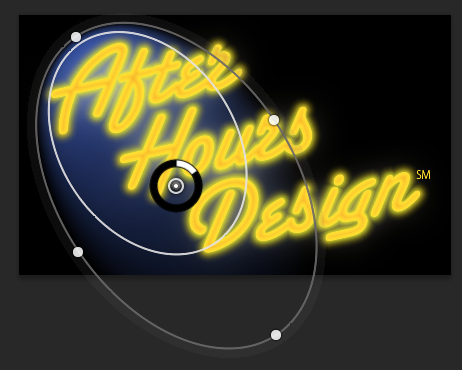
lighting effects with a single light Photoshop CS6's lighting effects options panel

To rotate the light, place your cursor over one of the handles of the outer ellipse. To expand or contract the light's illuminating area, click on the inner ellipse. Change the intensity of the light source by dragging within the inside central ring. You choose which type of light you currently are using by the top menu on the options panel. Additional lights are available at the upper left of the window.

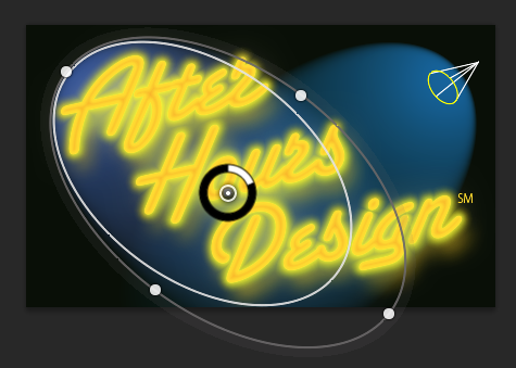
After setting the first light, I added another spot with a slightly greener blue color.

lighting effects with two lights

Use a texture with Lighting Effects

Now, this basic lighting effects stuff gives us a good start. However the wall is still just flat and uninteresting. I am thinking this would look much more appropriate as a brick wall. So, I just so happened to have created a seamless brick pattern to use. How will I use this? As an alpha channel that we can plug into the lighting effects Texture option.

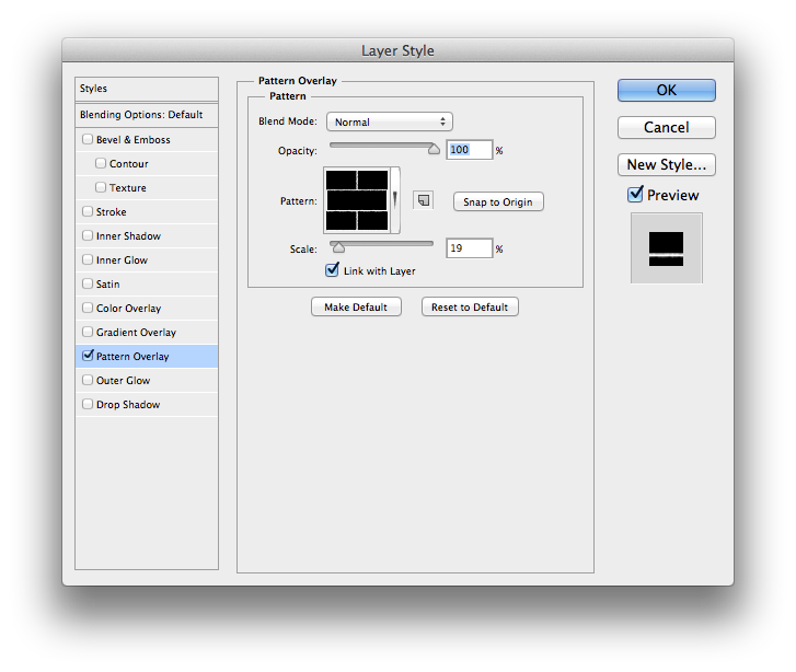
So, I next create an empty layer with the brick pattern overlay fill. The best approach for seamless patterns is to create them amply large, so you only need to scale down rather than up for their use. Here, I scaled my pattern down to 19 percent. (Hint: A pattern overlay allows you to scale it!)

brick pattern overlay
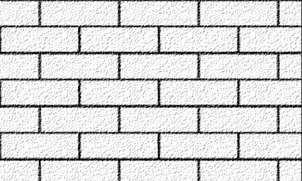
So, then I viewed this layer alone, opened the Channels panel, and copied one of the component channels (the Blue one) to make a new alpha channel. Next, I inverted this alpha channel, and brought in a Texturizer filter, to give the bricks some roughness.


Texturizer filter panel options texturized bricks in an alpha channel

Load edited alpha channel into LE Texture option

Now I'm ready for the final touch. I open the lighting effects filter settings on the wall layer and go to the Texture option. Then I choose the alpha channel I just finished editing to allow lighting effects to use it for a bump map.

choose alpha channel in lighting effects texture option
Now we can see the final result is much improved from the plain original, thanks to what lighting effects can do.

final logotype after editing

Friday, January 27, 2012

Friday, April 29, 2011

Video Compatibility Across Platforms

Like many other production artists, I work on Macs. Most office-related employees, such as account managers, work on Windows-running PCs. When is comes to exchanging documents between these platforms (and Unix computers), many things have become much easier than it was about six or more years ago. For example, fonts have turned a major corner over the last few years with the entrance of OpenType formatted fonts (.otf). The same OpenType font can function the same on any platform you use your document.

One Arena Remaining

Alas, the same is not true for video files however. For the most part, the video world is a morass of choices to make, like going into an ice cream shop with hundreds of flavors. I'm not talking about the web, of course. Most web videos, such as go on YouTube or into a web movie preview site, are translated via a Flash player or some QuickTime format. But when you want to have a video file say, saved from iMovie, play on a Windows PC in a specific program, like PowerPoint, then you may run into unscalable walls.

I have worked at previous companies that had some video production software and hardware that helped out in this regard. I’ve worked with Final Cut Express and related programs. With those, the translation to other video formats is a lot easier. But where I am working now, there is not much to work with except iMovie, QuickTime, Flash, iMovie HD and Adobe Media Encoder.

There are a number of video file formats available that most people are familiar with, but also dozens more. There’s QuickTime (.mov), Windows Media (.wmv), Audio Video Interleave (.avi), MPEG, or Moving Picture Experts Group (.mpg), DivX-Encoded Movie File (.divx), and so forth. For a comprehensive list this FileInfo page is good.

File formats for video, however, are only containers for the content. What’s more important are the languages used to translate that content from the file to the player. These are called codecs. Codec stands for COMpression and DECompression language. A video file natively is really big. Think of hundreds of pictures put together in a sequence, with each picture a certain resolution and dimension. Just one frame from an HD 720p video frame is 2.64 megabytes. Just a short minute of video that size could be almost two or more gigabytes!

So understandably to store and transfer video, we need these codecs to shrink the size of the video files. And when we play it, we need this codec to decompress it on the fly and send each frame to the player in time. Some codecs do this efficiently and some not so much. And the older the codec, the probability is that it degrades the original video a lot, or doesn’t compress it very much.

All this is enough to understand why I had the worst time trying to get a video file saved out of iMovie to play in Microsoft PowerPoint 2007 on a Windows PC. It would seem that there are many codecs for Windows Media files (.wmv) that are not accepted by PowerPoint. Now I am pretty sure that MS PowerPoint must use the system media capabilities rather than its own. I figured we needed a conversion capability to go into a Windows Media format. At the time, I only knew about Flip4Mac, which can play WMV files. A paid upgrade will allow some saving into WMV format. I soon would find out that it must take a lot more than just any WMV file to play on PowerPoint.

Flip Over This

My first impasse was with Flip4Mac. I got approval to spend the $39 to upgrade to the first level of capability for Flip4Mac to save out to WMV format on a Mac. I found quickly that $39 (plus tax) is not enough. For that price, you get a maximum of 640 pixels wide and only one pass VBR (Variable Bit Rate encoding). And the resulting quality is horrible. Not only that, but it isn’t available out of iMovie ’09. In fact, it isn’t available through QuickTime directly unless you wish to spend another $30 for QuickTime Pro. I only found the capability via iMovie HD’s Share menu. (To upgrade fully to all the WMV options you could need, please pay an additional $130 to the makers of Flip4Mac.)

What was even more disheartening was that the resultant WMV file would not play in MS PowerPoint on the PC. It played in Windows Media Player, however. Now if it is made by Microsoft, and it plays in one application they make, but not in this other one, what is the problem? Why wouldn’t Microsoft make all their applications compatible with what they work with, across the same platform, which they are owners of as well? Further trials to AVI and other formats did not help either.

Some Other Options

In the process, I found a couple of web sites that offer conversion of video and audio files to various formats. They are in beta version, and offer their services free to start. If you wish to have storage space or other features, you need to pay monthly fees that vary with the options available. One site is called Zamzar, which I liked because the quality of their conversion is very good. However, they use a DIVx codec, so video from there did not play in PowerPoint on a PC for me.

I tried getting QuickTime installed a PC to test whether QuickTime movies would play in PowerPoint on the PC. Nope. (Is there some issue with a PC and video of which I may be unaware? Possibly.) All I got was a black box where the video should have been on the slide.

The Answer

Well, after a few more well-considered options, and finding no solution, I decided to go a route I was pretty sure would work. Each of the PCs that were going to run this presentation had an up-to-date installation of Adobe Reader, version 8, 9 or X. And that meant one thing for video: Flash Video, or .flv format.

Over the last few years Adobe has been working on the problem of video compatibility. Since there seemed to be no progress between Windows Media on the PC and QuickTime on the Macintosh, the programmers at Adobe went ahead and made their own media format to run cross-platform without depending on the operating system’s video rendering engine. They came up with Flash Video format. This works now inside Adobe Acrobat, Flash and other Adobe programs.

So, to make this easy to end, I converted the QuickTimes from iMovie to FLV via Adobe Media Encoder. Then I saved out the PowerPoint presentation as a PDF, sans the videos. Then in Acrobat I placed the videos, set up the transitions to auto flip based on the rehearsed times from the PowerPoint presentation. And now everything in this project functions just fine on PC and on Mac. And that’s all I was asking for.

Friday, February 4, 2011

Microsoft Office and the Graphics Blues

There is a persistent mythology in the office/corporate world that the suite of Microsoft Office applications, MS Word and PowerPoint in particular, are useful and capable for creating print-ready materials, that is, printed professionally at a print shop. Along with that follows the corollary that web graphics are just as good for print, and thus many logos are grabbed from web pages and given to some designer or marketing department to use for brochures and other printed materials.

Now both of these are as far from the truth of good graphic art as you can get, and each for its particular reasons. The Microsoft Office applications are what is of particular interest to me here.

Now, to be fair, some of the reasons for this are not completely the fault of the programmers’ lack of vision or ambition. The aim and purpose for these apps does not include print-ready work, such as annual reports and brochures. They were intended to be used for work that will be printed on the office copier/printer.

In return, Microsoft never has placed any kind of disclaimer on their packaging or installer that squawks to the user, “Don’t use these for anything you need to print professionally!” And so there is still much ignorance in circulation over the Office Suite. For that matter, any office productivity application is the same, including Open Office, iWork, and so forth. And with the introduction of MS Word’s Publishing View, people are even more apt to be mislead.

Do you realize there are still (and probably still will be) many MS Office files getting submitted to print shops? In fact, many probably are being submitted to print shops as PDF files saved out from Office documents, which in some cases leaves the print shop employees rather stuck with how to properly service them. But that is a topic for some future article.

But let’s tackle one small issue first, and that is what kind of graphics should be placed in an Office document in order to get a decent output from an office printer? When it comes to presentations made solely for on-screen viewing or projection, and mostly from PowerPoint or some like application, it really is of no consequence what the overall quality of an image is. As long as it looks good on screen, it will display or project just fine.

There are many file formats you could choose, but the best are PNG, JPEG, EPS or PDF. I like the PDF option the most, because it can accommodate vector elements as well as raster or photo elements. Also in my most recent tests I have found that the latest versions (2010/2011) of Microsoft Office handle EPS files very well, even rendering them on screen in PowerPoint presentations with surprising quality. (Some of you may remember that EPS files used to only display their lo-res preview in older versions of PowerPoint.)

Printing is another issue altogether, of course. To get this right (for those of you who may not know) we have to look at something called resolution. Resolution has to do with pixels, which is what any kind of digital photograph, for example, is made of. The resolution is usually measured in either of two ways. One is the total number of pixels in an image. For example, a photo at 8 megapixels is basically 8 x 1024 or more than 8,000 pixels across. Otherwise, look at the published dimensions of the file, and note how many pixels in an inch (or whatever unit of measure you use). For example, if our 8 megapixel image were printing at 10 inches across, then it would be roughly 800 pixels per inch across. That’s what we would call a high resolution image.

For screen display or projection of MS PowerPoint images, they need only be at the most 100 pixels per inch, and can easily get by with less. For print, it has generally been the rule to have an effective resolution of 300 pixels per inch, or 300 ppi, all for reasons we don’t have the time or patience to explain here. Let’s just say that it’s regarded as enough density to keep from seeing individual pixels on the page.

Also remember to keep the scale of your graphic to maintain the resolution of 300 ppi. What throws that out is enlarging your graphic. Generally you can scale down, but not up. Scaling up will reduce the overall resolution. If my graphic came in at 2 inches wide and 300 ppi, then I scaled it to 4 inches, it would be only 150 ppi, because at twice the size, it will be half the original resolution. We effectively spread those pixels out over a greater dimension.

When you initially import a graphic into an Office document, it will come in at the original size and resolution at which it was created. That is helpful, because in earlier versions, it might come in at an unpredictable size. On the other hand, it can be hurtful if you are importing that 8 megapixel photo.

Now let’s discuss the fun topic of color. If you’re not familiar with the subject, there are two basic color models we work with in the document publishing world: RGB and CMYK. RGB stands for Red, Green and Blue, which are the main colors that separate from white light. This is what all electronic displays use, from TVs to your iPod screen. On paper, we have to place pigments mixed together to render all the possible colors. We can’t afford to print lots of colors, so a process was invented to mimic the opposite of what RGB does. Making that long story short, we use Cyan (opposite of Red), Magenta (opposite of Green) and Yellow (opposite of Blue). And we add in Black (K) to give us a real black, because the other pigments are not perfect.

With all that said, Microsoft Office and all other office applications use the RGB color model. Professional printing uses CMYK. So that makes MS Office documents incompatible with the printing process, initially. The fact is, however, there is less need for CMYK original documents. There is more than enough technology that is able to convert RGB documents to the needed CMYK for the printing press. The only caveat about it is that if you leave your document RGB and have your print provider convert the colors to CMYK, then you have no real control or say in what the end result will be, because colors will shift, especially if you picked out bright colors.

One solution would be to pick colors, not from the default Office applications’ set, but from the computer’s color mixer app via the More Colors... option. In there, choose the CMYK sliders to make your colors (sorry Windows users, this is only on the Mac OS!). Sure, the color model is still RGB, but at least your color choice will fit the range of colors CMYK can reproduce on a press.

If you do have to send a Microsoft Office document to a print shop, don’t. The best strategy is to save it out as a PDF file. This will prevent the printer from not getting the proper fonts and graphics that you used in your documents. However, if changes need to be made, you will need to make them and send the print shop a new PDF file. New versions of MS Office have the PDF format as an option in the Save As dialog, and believe me, it makes a better initial quality of a PDF file than using such things as PDFMaker.

In conclusion then, you have challenges and choices in how you use Microsoft Office applications, what you place in them and for what you use them. Keep the ideas I discussed here in mind, and you will have better quality results.

Thursday, November 4, 2010

A Circular Ending

A green capsule shape, with perfectly circular ends.
Sometimes you find yourself needing a quick way to accomplish tasks and assume that those methods somehow work the same across applications. I recently ran into a big issue over a small detail that tripped up the quality of my work, and that of others. I needed to turn a rectangle into a capsule or end cap, for lack of a better description. Not an oval, or just a roundly-cornered rectangle, but a shape that ends in a perfect half-circle. Where I currently work, this shape is an essential part of our brand identity.

There is a certain method you can use in QuarkXPress, Adobe InDesign and Adobe Illustrator, combining a circle precisely placed halfway over the end of a rectangle using a Unite or Merge path function, also called Pathfinder in Adobe Land. Placing a circle over the end of a rectangle. A Pathfinder Unite function will be applied to it.(Some future time, I should explain and demonstrate Pathfinder more thoroughly. It’s the best graphic invention since sliced bread.) If you had the circle placed exactly halfway, you should get a perfectly circular end for the shape, with no doubled anchor points where the rectangle’s end and the half point of the circle overlapped. A look at the anchor points of one example created in Adobe Illustrator shows a proper result with just three anchor points.A successful uniting of a circle and rectangle using Adobe Illustrator

However, I am one to try doing this stunt in less time and with less clicks. That’s my motto! I can create this using just one rectangle.

Here’s how it works in QuarkXPress: Copy the short width of the rectangle, paste it into the corner radius field on the Measurements palette and divide it in half. For example, if a rectangle had a short side of just 6 picas you would enter “6p0/2” into the corner radius field. (This allows you to use a rectangle of any measure; you don’t have to do the math.) Unfortunately, in QuarkXPress, you need to use a short size no more than 4 inches; QuarkXPress’ corner radius is STILL limited to 2 inches.Setting the corner radius of a rectangle in QuarXPress
Anyway, I digress. What is your result? A perfectly circular end cap.

“Now,” I”ll say to myself, “I should be able to do the same thing in other applications. No problem.”
So, I’ll go into Adobe Illustrator. Here’s a slight difference, because Illustrator’s corner radius is not dynamically adjustable. You have to know ahead of time what the radius should be, and that totally depends on you knowing what the short measure of the rectangle will be when you draw it out. Have fun there. But if you have a dimension in mind, you can Option-click with the rounded rectangle tool, and right there enter the half of the short side’s measure for the corner radius (as shown).Creating a circle capped rectangle using the rounded corner rectangle tool.

Luckily, Adobe Illustrator also has a cool feature in the Effects menu for a square cornered rectangle you already have drawn out. (And it also works on open shapes too, so it’s handy for die lines and such things.) Select the rectangle, copy the short side’s measure from the Options bar, and go to Effects > Illustrator Effects > Stylize > Round Corners. Paste the measure into the radius field, then type “/2” after it. If needed you can expand the appearance of your end cap, but of course it’s not necessary.

What’s next? Adobe InDesign. And here’s where the trouble comes. I expected all these years that Adobe InDesign would act the same way as QuarkXPress and Illustrator. But I recently discovered that NOT to be true.

In previous versions of InDesign, you can use the Corner Options dialog to set it, similar to Adobe Illustrator.InDesign CS4's Corner Options dialog Curious and disappointing is the result you get if you want the perfectly circular end and input half of the short side. Compared to a true circle, you will notice the bulge. It doesn’t even pretend to be circular.InDesign's out of round corner radius set against a true circle.

InDesign CS5 now has the ability to dynamically change the corner radius of any rectangle—finally, after 7 versions! However, even that doesn’t help us here. The results are still geometrically out of round.

So in InDesign, we come full circle to using Pathfinder to accomplish this task. Of course, even this beats manually splicing the two shapes together, which, more than 10 years ago, was the only choice for doing this.

Wednesday, August 4, 2010

Keep It All Together

How to prevent your type elements from breaking apart.


There are times you want to allow words to break down to the next line in a block of type. The judicious use of a discretionary hyphen – one that breaks apart a word if that word is close to the margin – is important for the proper flow of justified columns of text, for instance. The whole concept of hyphenation and justification is out of the scope of this discussion, however.

Much more often, where the text is somewhat more concise than a magazine or blog article, and its appearance is more critical, you really don’t want to see any hyphens, but then you may run into some other issues with your type. For example, you may see phone numbers break at the margin and finish on the next line, and you don’t want that by any means. You also may have a company or brand name that is not supposed to ever break into two lines. Harley-Davidson comes to mind here. Then there’s the pesky instance when your email or website address breaks at the “www.” or the “com” end.

For work on the web, there may not be much help besides a forced line break. But in printing, with a good layout application at your side, such as Adobe InDesign, or QuarkXPress, you have all the tools you need to accomplish this task.
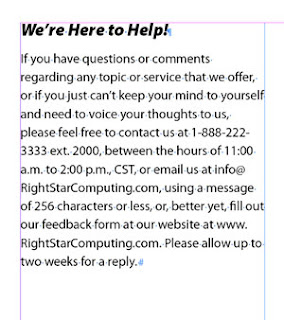
Say, for example, you set up a contact message for your client; the usual, with the phone number, office hours, email and web address. If you don’t want hyphens, you should turn off hyphenation before you proceed. Now it is time to tackle some of those items you don’t want breaking apart.
a sample text block showing broken phone number and web address
Seeking a single line dial-up

Phone numbers are never easy to memorize, but that’s even more difficult when they break down to the next type line. A typical solution for many is to use a forced line break just before the phone number starts. This keeps the phone number on one line, but visually it may be on the wrong line, and you may end up with a large visual gap in the line above.
a forced line break

Let me just suggest right here that you make forced line breaks the LAST RESORT for fixing type events like this. Refrain from using them until the final tweaks of text tweaking. The whole issue is text flow. If a forced line break is in your type, and you for some reason change the type size or margin width, or edit wording in a paragraph or sentence, then the text flow shifts, and now the forced line break causes a new problem, and you need to delete or reposition it.

With the following solutions, you need not resort to the potentially problematic forced line break patch-up.

Nonbreakable

The answer for a phone number (at least, if it uses hyphens) is to use a nonbreaking hyphen. Nonbreaking hyphens are discrete, because they look and taste just like normal hyphens. But they have the power to hold words and characters on either side of themselves together.

Simply select the hyphens in the phone number in question and replace them with nonbreaking hyphens. Both QuarkXPress and InDesign have access to the nonbreaking hyphen character. InDesign can access it via a context-sensitive menu. QuarkXPress also allows nonbreaking en and em dashes, which InDesign doesn’t.
InDesign's context menu to choose the nonbreaking hyphen
(What I am frustrated by with InDesign on a Mac is that even though you should be able to access a nonbreaking hyphen with a keyboard shortcut, the default command never works. I have used InDesign from CS2 through CS4 on several Mac systems over more than five years, and I have never gotten it to work, unless I set up a custom command.)

Another important helper is the nonbreaking word space.
InDesign's
Possible circumstances you will want to use this for is such things as dates (August 7, 2010) and times (7:00 p.m.) So just like the previous hyphen issue, select the word space between the words you want to keep together and replace it with a nonbreaking space. (I am happy to say that InDesign’s keyboard shortcut for this one works!)
a nonbreaking space in action

Fixing the dot-com break

Because a website address begins with a “www.” and ends with “.com,” or such, there is a tendency for it to break at these points. This is where I used to place a forced line break before the beginning of the web address to fix the problem. I don’t do that any more. Why? Because I found a little special character called a Non-joiner tucked away in the Other sub-menu of the Insert Special Character menu of InDesign.InDesign's Non-joiner menu
Technically, it is not a space. This makes it handy to place it between any two characters to prevent a break. (For QuarkXPress, you can place a nonbreakable flexible space and horizontally scale it down to nearly 0 width.)

So I place my insertion point on the right side of each “dot” in a web address and insert this non-joiner. Voila! This web address will not break any more. It will flow in the text naturally to whichever line it fits on best.
an example of a web address with non-joiners to hold it together

So wisely using these special characters will allow you to have more control over the look of your type, minimizing restrictive forced line breaks and similar inferior solutions.

Wednesday, July 21, 2010

Efficiency

One aspect of doing production art is the aim at being efficient. Of course, accuracy is key, but after that has been established, you need to examine a project or your everyday workflow for ways to streamline the processes involved.

It’s just like any kind of manufacturing workflow; if you want to increase the profitability of any process, you need to look at how to make the end product with the same or better quality in fewer steps, if possible, or make the steps you take more efficient.

Currently, I am working on a project with a client, where the process of the production for some document type has had an established process for about two years. One production artist employed previously had some scant documentation which I was to follow. The current production artist on staff needed some help with the overflow work, and some of the jobs had unique twists that were also giving some unexpected results when following the currently understood procedures.

So, I took up this project with an aim at first learning the given procedures, then examining the whole aspect of the workflow to see what can be modified, or fixed.

After being on this assignment for almost two months, what have I discovered? Basically, almost half of the steps that used to be taken to work on each job were never really necessary.

If the previous production artist had had the time and asked the question “Is there anything I can do to make this process better?” he may have tried a few things, or looked at how the software REALLY works, just to see what could be changed.

There is no harm in copying a layout file, for example, and trying something to see what happens. What’s the worst that could happen? Either the document is so screwed up, you need to revert, or the application might freeze or crash. Big deal.

If not, maybe you see something that needs to be done differently, or you stumble upon a way to do your work in a few less steps. And in a busy workflow, that could save many minutes over the course of a whole day.

What did I do?
  • Pre-emptively set up an efficient set of type styles that fit into all elements

  • Identified adjustments to the procedures that by-passed the previous need for several work-arounds

  • Fixed some problems caused by a script by writing a new script that did not create the same problems (the original was JavaScript, I used AppleScript)

Now, we can do the production for these documents in half the time they have been done. That might allow the company to which I am now assigned to keep their staff for production artist at one. That might mean I may not get offered a permanent position by them. But that at least means I should get a good report from them to the temp agency for which I am working. Hopefully, that will land me another assignment quickly after this one’s done.

So what are some things you can do or have done to increase your efficiency?

Monday, January 4, 2010

Production Art? What’s That?

I am starting this blog to discuss current and past issues in the realm of graphic Production Art, speak up on ideas and trends, or comment on ideas already out in the Graphic Arts industry that affect Production Art, and share work methods and tips & tricks.

Right now, I just want to say some points on what graphic Production Art is. It’s kind of a limbo discipline. It is stuck halfway between Graphic Design and Final Output/View. Since the beginnings of the Graphic Arts, it used to be limited to only printing, but that has all been changed with computer-based publishing, the Internet and the proliferation of interactivity to many publishing outlets.

Though the media may differ, the objective is the same: Make the end product look as it is intended, and make sure it functions properly to get it to the viewer the best way possible.

Now, that is fairly broad, but that is because the road a Production Artist takes to a well-crafted and functional file, or brochure, or what have you, will wind through a multitude of graphic processes and evaluations, then fixing as needed.

For any of you who are “new” to Production Art, at least in experience, let me give a rough overview of who needs to or does it, and what is usually involved in doing it.

Who Does Production Art?
There are basically three groups of people in Graphic Arts who utilize Production Art:
1) Art Directors / Graphic Designers
Those who have to do Production Art are usually in the need to do it, mainly because they are in a small agency or department, or working freelance, and may have to fulfill all the duties in getting a design out to the client or vendor.
2) Production Artists
These are dedicated to mostly processing the files as they come from Art Directors and Graphic Designers, and are usually a strategic part of the workflow in a larger agency or graphics shop. Production Artists need to have as much creative as technical know-how, because they may need to often re-apply approved designs to other media pieces or throughout a campaign, varying the formats and aspect ratio of elements.
3) Pre-press and “Output” Operators
These are the ones who get the "final" versions of graphics files from 1 & 2, and maybe other sources, and need to process them to the actual final state for the intended use. Now the job isn't just printing; it could be web pages, mall kiosks, digital billboards or such like. When these files come in, they may need changes, or on further evaluation, some elements may need to be fixed. These persons are more tech-oriented than creative in most cases, because of the high degree of technology involved in the final delivery of the work they need to support.

What Does Production Art Involve?
Like I said before, there are many processes and areas that must be undertaken in the work of Production Art. Some of these are obvious, and others are so behind the scenes that few are aware they are done at all. These will usually include (but are not limited to):
  • Page layout -- which itself is a multi-faceted discipline
  • Image retouching and compositing
  • Color correction
  • Color concepts, such as color harmony and color modes (RGB, CMYK)
  • Illustration file servicing, trouble-shooting and fixing
  • Creative processes and communication
  • Final file, publishing and output specifications
  • Spelling and grammar checking
  • Proofing printing
  • Mock-ups -- setting up printed proofs to look and function as a final product
  • Preflighting -- checking and fixing files to meet expected output criteria
  • Measuring, measuring, measuring!
  • Word processing
  • Typography -- particularly, kerning, tracking, and stylizing and “massaging” text
  • Printing processes
  • HTML, CSS and basic web page structure
  • Multimedia formats
  • Image resolution
  • PDF workflow -- making, distributing, commenting
  • Computer file formats
  • Methods of delivery for project files
A Production Artist may not be an expert on all of these things, but will at least have enough understanding of most to be able to produce solid and reliable final files day in and day out. That means more than “enough to be dangerous.”

A Common Ground
The most important element tying all these disciplines and processes together is the arena of the page, or the issue of “pagination,” or page assembly. Now, if you looked up the word pagination, you may not find the job description of Production Art around. But the whole work of Production Art centers around getting everything properly onto pages, or layouts, whether static or dynamically made.

Think of it. A newspaper layout is a page, or pages. A web layout is a page. A screen of a billboard or kiosk is a page. I remember almost ten years ago, there was a lot of banter in creative and graphic art circles about the term pagination being used for this particular thing.

All visual and text elements that communicate must be paginated into a format that a reader can make some coherent sense from. It is imperative that it not only looks good at the design side of the life of that “page,” but that is also holds together on the reader’s end. The same might be said in way of illustration of a car. The design of that car can look great, but if it doesn’t run because the engine wasn’t assembled right, or parts fall off as it’s driven down the highway, then it obviously was not a successful production. There can be just as much work “under the hood” as visually in a graphic art production, to keep it functioning as well as looking great.

Good Qualities Desired
A Production Artist needs to have a handful of characteristics and skills to keep at the job:
  • Contentment doing that part of the job, rather than great design, at the time
  • A constant need for attention to detail, even the smallest measure at times
  • Tenacity to see work through to the end
  • Pleasure at seeing files are built well
  • Trouble-shooting instincts, to find problems and solve them quickly
  • Thoroughness to follow procedures
  • Speed -- of course, your boss or client needs it done fast
  • Accuracy
It is also helpful for he or she to be able to find and implement any improvements in a working process that may need it. For example, if a need is seen in setting up a useful filing structure for current and future work, can that Production Artist come up with ideas for one that meets the most needs?

Hopefully, here we can look at some of those issues and discover more about this often-overlooked job, and create some great dialog in the coming months and years.

Have any ideas or comments? Did I get anything wrong, or does anything need clarification? I welcome your input!