
How to prevent your type elements from breaking apart.
Much more often, where the text is somewhat more concise than a magazine or blog article, and its appearance is more critical, you really don’t want to see any hyphens, but then you may run into some other issues with your type. For example, you may see phone numbers break at the margin and finish on the next line, and you don’t want that by any means. You also may have a company or brand name that is not supposed to ever break into two lines. Harley-Davidson comes to mind here. Then there’s the pesky instance when your email or website address breaks at the “www.” or the “com” end.
For work on the web, there may not be much help besides a forced line break. But in printing, with a good layout application at your side, such as Adobe InDesign, or QuarkXPress, you have all the tools you need to accomplish this task.
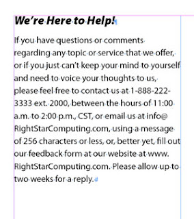
Say, for example, you set up a contact message for your client; the usual, with the phone number, office hours, email and web address. If you don’t want hyphens, you should turn off hyphenation before you proceed. Now it is time to tackle some of those items you don’t want breaking apart.
Seeking a single line dial-up
Phone numbers are never easy to memorize, but that’s even more difficult when they break down to the next type line. A typical solution for many is to use a forced line break just before the phone number starts. This keeps the phone number on one line, but visually it may be on the wrong line, and you may end up with a large visual gap in the line above.

Let me just suggest right here that you make forced line breaks the LAST RESORT for fixing type events like this. Refrain from using them until the final tweaks of text tweaking. The whole issue is text flow. If a forced line break is in your type, and you for some reason change the type size or margin width, or edit wording in a paragraph or sentence, then the text flow shifts, and now the forced line break causes a new problem, and you need to delete or reposition it.
With the following solutions, you need not resort to the potentially problematic forced line break patch-up.
Nonbreakable
The answer for a phone number (at least, if it uses hyphens) is to use a nonbreaking hyphen. Nonbreaking hyphens are discrete, because they look and taste just like normal hyphens. But they have the power to hold words and characters on either side of themselves together.
Simply select the hyphens in the phone number in question and replace them with nonbreaking hyphens. Both QuarkXPress and InDesign have access to the nonbreaking hyphen character. InDesign can access it via a context-sensitive menu. QuarkXPress also allows nonbreaking en and em dashes, which InDesign doesn’t.

(What I am frustrated by with InDesign on a Mac is that even though you should be able to access a nonbreaking hyphen with a keyboard shortcut, the default command never works. I have used InDesign from CS2 through CS4 on several Mac systems over more than five years, and I have never gotten it to work, unless I set up a custom command.)
Another important helper is the nonbreaking word space.

Possible circumstances you will want to use this for is such things as dates (August 7, 2010) and times (7:00 p.m.) So just like the previous hyphen issue, select the word space between the words you want to keep together and replace it with a nonbreaking space. (I am happy to say that InDesign’s keyboard shortcut for this one works!)

Fixing the dot-com break
Because a website address begins with a “www.” and ends with “.com,” or such, there is a tendency for it to break at these points. This is where I used to place a forced line break before the beginning of the web address to fix the problem. I don’t do that any more. Why? Because I found a little special character called a Non-joiner tucked away in the Other sub-menu of the Insert Special Character menu of InDesign.

Technically, it is not a space. This makes it handy to place it between any two characters to prevent a break. (For QuarkXPress, you can place a nonbreakable flexible space and horizontally scale it down to nearly 0 width.)
So I place my insertion point on the right side of each “dot” in a web address and insert this non-joiner. Voila! This web address will not break any more. It will flow in the text naturally to whichever line it fits on best.

So wisely using these special characters will allow you to have more control over the look of your type, minimizing restrictive forced line breaks and similar inferior solutions.